

 |
| This right here is my final book cover all done it paper cut outs. This was definetly a challenge for me mainly the fiddly text but over all i really like it. i think the colours are strong against the black and the shapes in the image and the text really pul through. It also has a kind of aboriginal feel to it with the shape layering which i personally like. |
 |
| This draft worked well but for a differnet book. i think the whole style of it is very childish in a way that it would suit a kids book. As my book is relatively serious i don't think it would be a great fit. |
 |
| This one got good feedback from my classmates they liked the shapes scattered around. This is something that i definitely used to help me with my final piece i used this one as an outline to experiment on. |
 |
| This one is a little bit different i went for a mathematical feel on this and made it very technical. i wasn't really happy with this it might work a lot better with colour but i think it doesn't illustrate the theme of the book to well. Would look nice if it was for a book about the mathematics of food however. |

 |
| These are some inital sketches for potential covers i tried working with a few medias to get an idea of what i would rather work with. I did like the messiness of the ink however i would want it to be colourful on the final thing because the book is based on synaesthesia which focuses on people relating things like music to colours. |


 |
| This is some development with cut out paper. I initally thought about doing this when i was choosing what media to use as i think the boldness of the colours will be very effective it is also a great for shapes to. |
 |
| This is some rough set ups of my potential front cover. This is with paper cut outs, this was one of the first times i have used this but i enjoy it as a media as it is a really nice way to create shape in your image. This fits well with the title as the cover is built up on shapes. |
 |
| This is some shape experimentation this help me decide which shapes will look the best for my final cover. I used a mix of media to try out some more playful shapes and textures which i could use for a digital cover. These will also be useful for future textures. i got them by rubbing paint on things around the house and see what pattern it would leave some like the soap where really effective. |
 |
| This is a digital mock up from the scanned shapes and face design. I think it works nicely digitally but i thought it would be more authentic to do the final thing all in paper cut outs. But i could scan my final one in and develop it on photoshop. I could change them into similar bold colours and shapes like this one. |
 |
| This is the final outcome for how to recycle a bottle. my main focus in the end was to centralise it around this one character who finds unusual and gross ways to use his bottle. I wanted to leave out the text as i don't think it would support the theme of the character well. My feedback was good some people mentioned that it might of been better with more colour involved which would work nicely in my opinion but some other people liked the slight blue splashes of colour. Overall, i am pretty happy with it i think the colours where a nice choice and i think the humour of it is relatively pleasant. |
 |
| This is my dream house created with textures and patterns and lines that we have previously created. Mine is a tower of elephants (trunk tower) each floor containing a new texture to it. it's a simple and doesn't use the textures too complexly within the work. |
 |
| Lonely Cafe is a ink drawing i wanted to have a lot of white space to go with the idea of the emptiness but the subtle black tones around helped balance it out. |
 |
| I got mixed reviews on the background of this some people thought it was cool but others thought it would work better with colour. I guess i think the white worked better with the theme of the article. |
 |
| I think this one is simple but effective i think it would work nicer if i enlarged to fit the full square. |
 |
| Here are some of my drafts for my editorial pieces. These are colour and tone experiments but after i did them realised that the white space in all the images added more context and gave it an empty feel. |

 |
| This is a alternate sketch of the restaurant from the outside and idea which i did like but i thought the inside will display the idea better as i can add more single folks in it. |
 |
| Some lines on the geometric shapes. These where for the words busy and quite and much and little i think the busy small lines compared to the less small ones a nice texture especially the less one i can imagine that one working well on a texture for a building. |
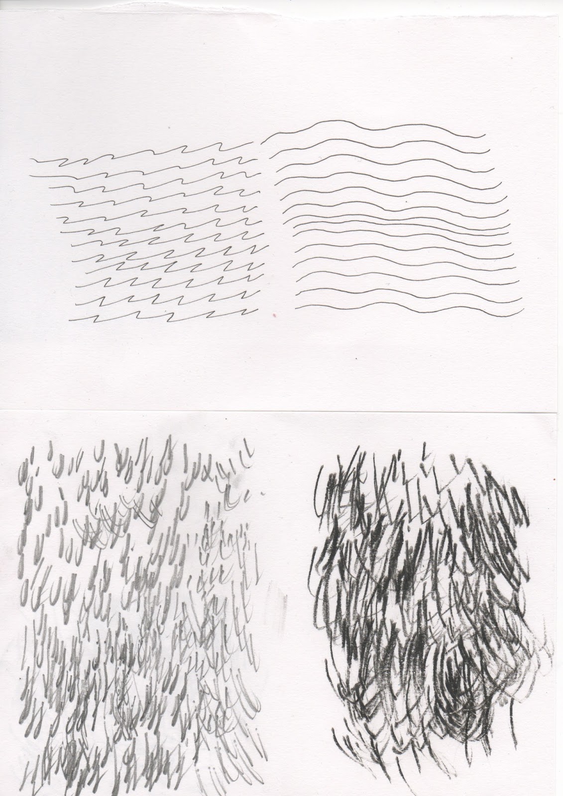 |
| Here are some focusing on more lines the 2nd one i created by just slaming my pencil down aggressively one of them i did less aggressive i think the darker one almost looks like a long beard. This could be a good technique for any future beard drawings i might do. |
 |
| This one took exceptionally long but i think it worked out nicely, it's busy but would be a great texture for any shading. |