Showing posts with label OUIL404. Show all posts
Showing posts with label OUIL404. Show all posts
Monday, 20 March 2017
Line of Sight & Depth - Windows
I have always found depth difficult it took me many different window views to finally get to one i seemed comfortable with as i do find it hard to draw 3d things and depth.
I really like my practice sketches for this i think even though they don't show much depth they have all the elements i need for my final thing which is what i set out to try and do.
When it came to my final one i picked my first sketch as it had the most amount of interesting layers that individually would be easy to create. I always wanted them to stand up as i think stuck down on paper then the depth wouldn't be effective. I also added a confused giraffe to add some fun and see if it add more perspective to my image. I think the first layer bars as a photo add a 3D element to the image which worked well.
In terms of image making the textures and patterns of the floor and trees are nice with the different tones of blues.
Trip to york
I was looking forward to this cause i really want to keep practicing my observational drawings.
I found drawing at the train museum was difficult though as there is lots to think about with trains.
I feel like my drawings from them are messy but i rather like them, the ones in pencil crayon especially.
I rarely do full bleed observational drawings but it's something i do want to practice so i attempted one in the park in charcoal and i think it worked nicely. It has a messy look to it but i think that adds movement and texture to it.
 |
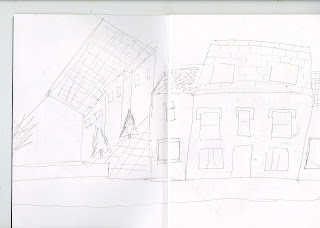
| I am a big fan of this one with the double media i think the line work is nice on the hut and the thicker charcoal lines on the tree add perspective. |
I approached this observational drawing more differently to how i usually do i definitely think a lot of the skills i learnt during visual language, help me realise that i can do observational drawings without them looking realistic and spend more time focusing on how interesting lines and textures and so on can make an interesting observational image.
3D Craft and Lens
I found this task difficult as it was hard to understand what kind of image the brief was looking for and how to use the frame effectively. I was slightly worried as none of it contained any of the things i have learnt before with illustration but i guess this was more about making an image.
I found it hard to think of a way of making my body mutated then i found these little houses i made with my sister a while back and instantly thought of this idea.
me and the father trekked out on a winter day on the moors for a sweet picture.
he was a crap photographer but eventually after setting it up for him i am happy with my outcome.
i'm also glad this brief was during the winter as it adds a lovely aesthetic to it.
i wasn't as happy with the composition of this image but i think the little house on the snowy hill looked nice enough to still include it in my blog.
Thursday, 16 March 2017
Composition and line of sight
I really tried to mess around with the composition for this I wasn't sure where to place everything.
I eventually thought it would be best to put myself hardly in it and draw it from a low angle to give a more interesting look to the 3 items.
This is the final image i wanted to use the trunk as a tour guide around the image so you start in the left top corner and then move down and see it all. I also think the trunk adds depth to it.
Overall, i am with this composition i usually struggle with forming an images composition but these sessions have helped me with techniques to make this easier.
Carrots and shape
Here are some shapes that are in the form of some tasty carrots. I learnt a heck load from this session as i was never big on the paper cut outs before but this really showed me how useful shapes are and how simple things have lots of potential.
 |
| Chopped up carrot |
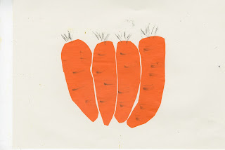 |
| These are all hanging out together i liked the shape of these ones especially think they really capture the unexpected shapes that carrots can form. |
 |
| tried to add more colour but i think this didn't work looks very halloween |
Fan art poster
For my fan art poster i chose Grand Designs as there is nothing more enjoyable than an hour long show of families struggling as they watch there dream project become a nightmare when there budget get's blow out of proportion and there glass gets stuck in Germany for 3 months.
I also saw it as a great opportunity to use shapes with composition.
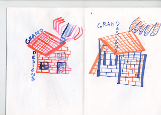
Here are a few of the drafts for the poster i wanted to enccorpart compostion with patterns and architectural drawings there are elements of each that i took for the final one. I found this very challenging to plan out what to put where to get a nice screen print. I also wanted to involve features like the path to add depth to the image.
I found that it would be easier to draw all the elements separately then put them together digitally for printing. This isn't a way i would usually work but for this poster i thought it might be the most effective. My idea for this was to pull out elements of the show that bring importance such as the usual uncompleted path and patio or the glass never making it in time.
it took me a few different compositons to get to the final one as I was worried of over complicating or making it too cluttered.
These are my final screen prints i originally started with the blue and yellow combanation but felt like the yellow overlayed on the blue wasn't very strong and didn't do much for the depth and composition of the image. Although i think the blue really made lovely textures on paths.
I then switched the colours so the blue was at the front and the base colour was orange and i think this made the image a bit more stronger. Although personally, i felt like the image still needed more as it all looked a bit floaty and empty.
As an experiment me and Oliver printed over each other screen prints and personally i think this created the most interesting screen print of them all. Which made me think that a bit more of a back ground might of made the image a lot more effective, I think in the future i'm gonna print over more of Olivers prints as they compliment each other very nicely.
Wednesday, 15 March 2017
Line and Texture
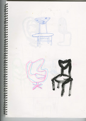
These are drawings mainly from reference. There is a mixture of wrestlers, chairs and kung fu. Each one is focusing on a different element the wrestlers is mainly just drawing from refernce with different media. The chairs are for texture and the kung fu is all about that sweet line.
Overall, these sessions have made me think about line and texture way more than i ever use to in my work i am also much more confident to just go straight into a drawing or sketch and accept that the outcome might bring interesting mistakes which will be useful for any final images or work.
 |
| I like the tones on this one i think the white and black are nicely balanced out. |
 |
| Add caption |
Overall, these sessions have made me think about line and texture way more than i ever use to in my work i am also much more confident to just go straight into a drawing or sketch and accept that the outcome might bring interesting mistakes which will be useful for any final images or work.
Drawing around Leeds
 |
 |
| These where a couple of playful pen texture and line stuff. I do quite like the one on the bench think the black deep tones look nice next to the other bits. |
 |
Subscribe to:
Posts (Atom)


