Monday, 16 October 2017
Sudio Breif 1 editorial finals
Here are my finals, they come as a set as i wanted to have a continuous theme flowing through the images, each image connects through the wire and starts with the mice to then finish the set with the earth as a sort of punchline to my editorials. I wasn't fully satisfied with the final image as the blues clashed and the stars need more blue in them but i think once the colours are adjusted it would make a stronger set of images. I wanted to give them a slight screen print effect, for example i didn't line up the mice perfectly to give it more of a analogue effect.
Overall, I think the idea could be visualised a bit stronger but each image individually works well and makes a playful set of images.
Studio Brief 1 editorial development
.
This is some of my editorial development, i didn't create too many thumbnails but i thought it would be easier for me to make a lot of images related to Douglas adams and then pull an idea based on there. I mainly ran with the idea of mice and there involvement in creating and controlling the world. I tried a few different medias and experiments on textures. I think overall the more simple shapes work best for me and will be easiest to collage with later on photoshop.
This is some of my editorial development, i didn't create too many thumbnails but i thought it would be easier for me to make a lot of images related to Douglas adams and then pull an idea based on there. I mainly ran with the idea of mice and there involvement in creating and controlling the world. I tried a few different medias and experiments on textures. I think overall the more simple shapes work best for me and will be easiest to collage with later on photoshop.
Douglas Adams zine
I enjoyed doing this zine even if it did feel a bit rushed. I selected various amounts of research that i gathered over the summer such as, his TED talk and elements of his book such as the meaning of lyff and hitchhikers guide to the galaxy. I was up for doing the whole thing mainly in paper cut out just because i thought it would be a good idea to stick to what i know and maybe develop it. I personally like the hanging falling whale and the pop out map. I did a lot of experimentation with textures and shape in the zine to outline some shadows and textures on the rocks and clouds.
I think there is some imagery in this that i would like to further develop into a more refined piece.
Wednesday, 20 September 2017
Angela Carter
I was interested in the idea of Angela Carter's books as i liked the idea of the short stories. However, from reading the first short story in "The Bloody Chamber" i kind of realised that i was in for a dark and gothic ride.
Angela had a very fortunate childhood in the sense that her family where very well off but she wanted to break away from all that and she had some confusing and mentally challenging relatoinships and was a strong feminist voice in society especially through the forms of her books.
The bloody chamber
 I approached this book as a starter to see if i would be interested in any of her other work. I did find the whole book to be beautifully written with detailed language of places, characters and emotions which where all heavily supported by mostly gothic but sometimes lovely metaphors. However, the subject of most of these short stories as a whole are as far away from lovely as you could ever get.
I'm not a big reader as a whole, but i wouldn't really say these kind of books are my thing. After reading each story i found it to get more and more disturbing and very dark. Obviously the subjects of most of these stories are metaphors of disturbing situations and predators (much like the original fairytales that these stories are based off) just maximised such as men being represented as beasts a lot throughout the book.which i think is translated well over these rewritten fairy tales. However, I don't think Angela's overall aesthetic of the bloody chamber and after some research some of her other books it's perhaps a bit dark for me. I think a challenge on this brief to move away from something happy may be a good idea but a lot of the subjects of her stories may be a bit too much.
I was happy to read a masterpiece in english literature though as devastating and disturbing as it might be.
 |
| wolf alice story response with ink and inverting |
Saturday, 2 September 2017
oliver sacks
Oliver Sacks is an established British neurologist, historian and author he believed that ''the brain is the most wonderful thing in the universe."
i have come across Oliver sacks before through other books on mental health but have never looked to thoroughly. I think the brain and how it works is a very interesting concept and an exciting subject to learn about, so i was excited to read the man who mistook his wife for a hat.
After reading the title i wanted to draw that scenario pronto. This book is full of interesting knowledge, humour and melancholy at times. The book is split up into 4 different parts focusing on various kinds of disabilities.
Tuesday, 28 March 2017
Stamps
I didn't really like my post stamps. I tried to keep them flowing with the same theme of the poster and postcards but I think they came off less effectively.
I tried to use the same colour palette as the rest of my work for a more effective set.
I think the circuit board one worked well i was inspired by a florucci patch i saw online which was from the same era as Giorgio and saw it as a good connection to his work and the fashion of the time.
Giorgio Moroder research responses
At the beginning of my research I mainly focused on his image and the basic elements of Giorgio.
This made made me feel stuck and a bit clueless into where i was going to take this project as i didn't want it to be an obvious portrait project. After talking to Jamie I realised that i should be looking into more about what Giorgio has done and influenced instead of his apperence.
This is when i started to focus more on Giorgio's influence on electronic disco music and 70's disco culture.
i never usually use paint or create a full bleed image but i think this worked out well and will be something i will want to experiment with more in the future.
 |
| This was one of my influences to do my work in a digital format as i think this made me realise how effective shapes can be digitally. |
Postcards
I was initially inspired to do these by a paper cut out image i made in the research.
From researching Giorgio Moroder i realised how many different elements of a synth he uses to create his disco songs. So i decided to create this separately as an initial experiment at first moving on from the paper cut outs to digital. however, from creating the first one i decided that it was an effective way to create these images. Maybe i should of experimented more with paper cut outs or other formats?
However, i felt like i wanted to create this work in a new format which is why i stuck with digital.
I wanted to make them all separate colours as they are separate elements of the same instrument which Giorgio is known highly for making mainstream which is the synthesizer.
None of the images are entirely accurate i mainly just looked at old synth and the shapes and then translated this on illustrator.
Poster for Giorgio Moroder.
I wanted to approach this project with a format that I'm not too used to just because I wanted a change from my child like crayon and ink drawings.
From my research I decided that digital would be a suitable format for Giorgio Moroder and also a change from my previous work.
The poster features all 4 of my postcards slotted together.
When I originally put them together the colours of them all clashed therefore I decided to make the poster one colour. I chose orange to relate to the 70s era in which Giorgio made his music.
I didn't however change the colour of the wires as i thought this slight mix of a different colour added emphasised the confusing wires that you might get on a Moog synth.
I then completed it with a similar looking piano synth that Giorgio would of used to combine the elements of how he creates his songs and the digital instruments he uses.
If i could maybe develop this poster more i would of quite like to of seen what it would of looked like as a screen print and the shapes might of translated well through this format.
sticker design and development
This is my ideas and development for the stickers. I started thinking of a nice selection of random acts of kindness.


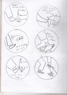
I thought about what sort of things would translate well into digital vectors and shapes so i played on this dog idea for a bit
i really liked my builder slogan so i decided to work on that i wanted to do it 100% digital so I drew out some concepts on paper first to make it a bit easier.
 |
| Add caption |
 |
| I found it hard to draw it out well cause i knew it would eventually be done on a computer |
 |
| The bottom one was the final one i decided on after that i would play around with it on illustrator to decide on the colours and the final composition. |
Subscribe to:
Comments (Atom)


