Sunday, 22 January 2017

Evaluation


Elements of my book that i didn't include but would of loved them to be there

unfortunately some elements of this book where lost at the printing stage. But when i have more time i would love to revisit and change them.
I'm not even sure how i missed this page of i guess i did one to many and in the stressy rush of getting it done accidentally discarded this page. This is a shame as I think the train idea was a neat one cause stations can get ever so silent without any trains there then when i train comes in the situation changes.
Here is the the lonely silent station I probably would of replaced the tiger page with this one as I don't think that fit with the flow of the book as well as this one did.
Unfortunately when i got the digital print room there was a missing link on my in design and this was the missing link.
A front cover with a much nicer title. I instead had to go for an awful font as i was in a rush to get it done i would love the opportunity to change as it personally ruins the image for me with a digital font. 

Potential Book Layout

This is a potential design layout for my book the pages would have acetate on each side to change the image from silent to loud. i would print on both the page and the acetate although i need to look into ways of sticking the acetate onto the paper

Final Pages For My Picture Book

 Here they are.... my final pages but combined together!!
These are both the drawings and the acetate overlapped so basically the noisy images.  
I got this idea for my book from a chat with my dad we were discussing all my research so far and he mentioned what it would be like if i imagined all the places i have been to without noise.
The idea of absence of noise really interested me as it was a whole new way of looking at silence.
This got me imagining even more unusual situations without noises.
However, when it came to drawing situations without noises i became extremely stuck i found it very easy to draw noises as i focused it a few times in my research. But it's hard to create something that doesn't exist.
So i thought if i drew out the noises maybe there is a way of getting rid of it. 
I began to draw loads of drawings of situations that are particularly noisy to me which then gave me the idea of getting rid of the noise by removing the acetate away to reveal a much more silent image.
This was an original idea i had of an empty sink with no cause for any noise, however, when you turn over the acetate it fills up with water and drips and plops just like a real sink would.
Pools with no one in are especially silent. Therefore i added a layer of ink with someone splashing in to help visualise the noise of a busy pool.
I did this pool in crayon which i think works well with a layer of ink.
most my layers where done with ink as this translated well on acetate.  

I think this one worked better than some as without the acetate the origianl layer does have a very silent asthetic to it.
However all that goes down the train when the wind picks up and blows this poor dog walker away.
I focused on a lot of these to make the text seem as lively as the image so for example on this i curved the o's to give the element of the word being blown around along with the people.
I think there would of been an even better way of showing this but i think there is still an element of that just much more subtle.

I did a lot of the base images in crayon as i found this as a quick way of making a fun image.
I didn't want any of the images to be too detailed as i think the playfulness and child like drawings helped translate the idea of silence in a fun way.

This is one of the inside pages I didn't want any of these to be iamges as they are usually left blank but i think adding the words from around my book to form a big sound board is an easy pattern to fill these pages.
I did something very similar to this in YSP for my research (which was a big starting point for this book).

The jazz band was one of the hardest ones to line up. This image also doesn't make a lot of sense without acetate
but i think this adds a slight element of humour cause that's what the image would look like if they didn't have the items that make the noise which leaves the people looking fairly stupid.

Here is a simple one of a dog not much changes in the layers here. Although i thnk the "arf arf" adds a lot more personality to the dog as it gives it a voice. Every time i look at this with the word i have my own particular voice for this dog.

The composition of this drawing isn't something i have done before i usually form my drawings in a way that make sense.
Although i really enjoyed just combining the elements of something into a drawing without a realistic composition as it gives you more potential to focus on particular characters and parts of a scene.

I enjoyed making a lot of images on here that don't really make too much sense i think it adds a lot more fun to the book.
Throughout these pages they have all been done with Crayola crayons and ink. I decided this from having peer reviews. This pages is a representation of using both. I think the crayons gave some very nice textures to my book and it's a good way to overlay colours which i thought would be effective especially if i'm printing on acetate. 

This is one of some busy chefs i got one of the drawings from my sketch book which prompted the idea for this (it's the one with the cut out fruits) i think the paper cut out fruits is a nice addition and brings bold colours to the dull colours of the chefs. 

I liked the idea of the alarm clock as i knew it would be an easy one that changes.
I did this image purely with crayons which does make it child like but i think this is a pretty fun aspect of it


This one was one of the ones that i think represented my idea effectively. i am worried that the closed eyes of the babies will ruin the acetate eyes i am also worried about the placement of this on acetate  as if it's not lined well it won't work.

Saturday, 21 January 2017

Book Development and noise drawings

This is the development stage leading up to my final book.
While doing all my research i decided how hard it was to find silence, so i decided to just keep concentrating on noises. I liked to imagine certain noisey things without noise.
I found that it was helpful for me to do this by writing down the noises.
This was also a really fun thing to do because i think a noise becomes really silly when put into words.
These are a couple of crayon landscapes i did of Leeds. Both are done during quiet times so there where not many people around however these could be used to add noise and potentially people. Acetate would be an effective way of adding this in as it looks relatively quiet but if i added the noises aspects and words to it then the image would be completely different.

You can't get more irritating the the dingdingdingding of an alarm clock
this is an especially terrible noise as we usually relate it with getting out of bed.
I did this with paints on coloured paper and i do like the bright bold colours.
The yellow bits would be the addition to the drawing as before it just looks like a clock
but when you add the dingdingdingding and the wavy yellow lines it becomes more noisy as a picture.
Dog barks don't usually irritate me as i do like dogs but i get woken up so many times
from dogs having barking arguments so i wouldn't say it's a pleasant noise.
this is similar to the clock in a sense as before the word and the lines it's just a dog
but when you add the word WOOF it becomes a dog barking. 


roads = very noisy

babies are horrendously loud! this would be a good addition to my book
i could potentially add a sheet of acetate with a different mouth to change the babies expression.
i might possibly try that and play around with the potential of adding emphasis on noise.

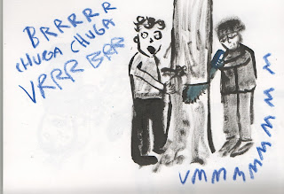
These are 2 tree surgeons with the noise of dying trees. I do enjoy the dry ink on this image
i think media is going to be very important in this maybe keeping the drawings black and white might make the text stand out a lot more like on this image which is very important as the noise words are the main focus.

Here are 2 options for a live band i like the busyness of the jazz band.
I think the subtle colour of the instruments are nice maybe this would work well for the final book?

I do quite like dripping noises but i think if i had to listen to it for non stop i would go insane
perhaps i could add the water in with acetate so it transforms from a quite gentle sink to
a loud tip, tip, blobbing dink with plenty of water.

I walk past a few building sites daily they always interest me but the noises are horrific
there are so many noises going on at one time it's hard to concentrate on what's the most annyoing,
I guess that's why they all wear headphones.
Maybe that's something i can add over the top as they won't need them until it becomes loud
i think emphasis on the noise on the power tools could also be effective.

Pool noises are usually just many splashes and kids screaming but i think it can be
a very quite sight when it's empty so i could potentially add the person over the top so you could take away the
focus of the noise.


I really liked the orange on the black coloured paper  could maybe work to help bring
out the text and the noises.  

I do really enjoy the small bit of colour on this.
Addition to this noisy eating is one of the worst noises by far.

This is a gouache painting of a washing machine.
I really enjoyed using gouache on this and think it gives it a playful look
it also is good for tonal images.
On top of this i think the yellow text is a wise choice as it contrasts well from the blue.


This is one i did with an overlayed sheet of acetate i added the blue text but was thinkning that i should
aslo add the people on top so it transforms from a quiet city landscape to a really busy image bursting with sounds and actions. 

Screen Printing Induction and Map making

We began our research in Leeds corn exchange. As soon as i got there
there where loads of dogs just walking around without owners. This entertained me and was the starting point to my research. I attempted to draw all of the dogs of the corn exchange but they where all fast movers so they where all done fairly quickly and rushed.
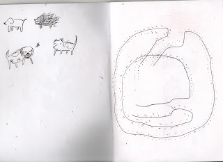
I also drew a basic birds eye map of the floor lay out and walked around drawing dots for every foot step i did.
I thought this could be a good starting point for a map.

We then headed to Kirkgate market which is always full of life.
I tested how loveable i am by using the love tester and got a successful 7/10 ( sensuous) which was pretty accurate.
I was very intrigued by all the market stall people shouting different phrases to attract my attention.
I even got offered drugs by someone who should probably be in school which was a first for me at Kirkgate.
These where all interesting points for our map.
This happy fellow was drawn by a lovely member of Leeds Armoury she drew me and i think she did a pretty great job of it to as she made me look like Harry Styles which was nice of her.

I finished my trip in the Leeds armouries where i went through and looked at some of the textures from the weapons and the building.
I also did a wrong handed drawing of this man in a boat which came out looking like Donald Trump.

This is a developed version of some of the drawings of my trip before they where combined with my groups to make this map.
I wanted my drawings to have a nice texture to them as i was interested to see what these would be like screen printed.
This is the final outcome. We decided to map out Kirkgate market as this was a place that each of us had indervidual events happen to us. We began by mapping it out as an overview of it with all the squares and then placing each of our illustrations on the map where the event took place. I drew the love machine market stall man and dog which where all elements of my trip and experience in the market which i enjoyed the most.
The process of screen printing was ver enjoyable I think the controlled aspect of it makes your images seem relatively clean and organised even when they may not be. I also love the overlaying of colours that's possible with screen printing.
our choice of green and red worked nicely without looking too festive.
I also enjoyed the process of working with a group especially when it comes to ideas. it was less important for the process of making it. 

Transcripts

These are the transcripts from some conversations i had leading up to my initial research i wanted to get a good idea of places i could go to guide my research most of these conversations weren't too beneficial in terms of finding out more about silence however all the places i went to that where mentioned where.
I didn't ask that many interesting people about this though i guess i found it hard to find someone who would give me answers that i would want to hear. I think i was looking for people to give me places with a lot more context to them but most of them where there cause people just liked it.


These are the Transcripts from me visiting all these places and recording my thoughts I did this in retaliation to the fact that my brain makes more effort to think of things when i'm alone to keep myself from not getting bored.
These where starting points to some of my research drawings and i possible direction for my research.

Sunday, 1 January 2017

Another handful field trip


I went out on a few more trips to the Yorkshire sculpture park and Otley.


This was at the Yorkshire sculpture park. I originally sat down to draw a sculpture in a peaceful part of the park (although off peak the full park is wonderfully silent). However at the time there was also this kid who was shouting for his dog named Jill (which is a weird choice of a name for a dog sounds more like an auntie) This instantly distracted me from concentrating on silence and thought I would approach this field trip research from the other side and focus on the noises of the Yorkshire sculpture park.
I created this in oil pastels which i quite enjoyed working with it gives it a child like look especially on the text which looks playful.

This is one of many ducks that where quacking around while i was sat down at the sculpture park. i think natural noises
are much more listenable however, i guess that's why people listen to bird noise radio. For this i stamped an ink pad on the page for the blue background but this didn't really work the page also has markings from my oil pastel drawing but i like the textures that this brought to my image i like the fact it's not very controlled. 

Here, are several more ducks making noises there was an island of them which i thought was cool they must of been about
20 - 30 ducks having a great time on this small island. These are just simple pen line drawings i enjoy the process of doing this as i can get images down very quickly which is good for ideas.

Once i thought about concentrating on noises on this field trip i immediately made an almost sound board of text noises.
some of these where more annoying then others and i tried to symbolise that with the size and length of the sound. I think this is good refernce for any text of noises for animals or potential sound effects i think i will continue to try this just to build a big research of noises translated into text. 
These are drawings from my trip to Otley on my way there i was across a mother and her child who said 'innit'
after every sentence which i found funny. she also ate way too much KFC for a child which resorted to her
feeling like she was going to throw up. This was a reportage drawing  and i kinda needed to act fast cause everytime the kid said something funny i needed to do a quick drawing but i think it builds up a little story and i think some of the lines in this are nice. 

This is a drawing based on this shopping list i find in the dirt in the middle of the otley woods.
I decided to keep it as a potential source of inspiration for any kind of story.

I wanted to work on colour paper when doing this as it's an easy way to introduce colour. This was a quick reportage of otley's christmas fair i thought i should introduce more images of sound to maybe get a better understand of silence?
Overall, i really like an orange and black colour combination and i'm excited to do more reportage on colour.

here is a quick ink drawing of the biggest line of hikers i have ever seen!! this might look cool as a completed image
if i took time drawing the 70 odd more of them all coming out one by one out of the woodlands.

127 hikers in total also this is a representation of my stability while hiking as throughout these filed trips.
my legs slipped on most rocks. I think i will translate more thoughts into drawings to build more research
on me throughout these field trips.