Reflections from past works. What worked for you in the past and what did not?
I've dropped paper craft to focus on printing and 3D work paper craft help me realise the importance of shape and colour and gave the humour a simple and naive way to display my ideas but i'm ready to expand into new realms. I have filled many sketchbooks of silly ideas to then hopefully develop them furhter
- Contextual inspiration. This can include works of others from all disciplines.
hard to pin down
wonder showzen (tv) trash art, general sad life
- External interests that have an impact on your practice.
-Your aspirations and goals.
i want to go big
big 3d sculptures
big 3d paintings
kind of a fine art edge to my work and humour
make big jokes
-The audience of your work.
anyone up for a laugh
-What do you want to say with your work?
i only out here to bring smiles to even the most ugliest of faces
-Finish your pitch with an image that you have already produced that you feel captures your current aspirations with a one liner that underpins your creative practice.
Monday, 22 October 2018
Wednesday, 9 May 2018
Studio Brief 2: Individual practice
I chose to work within adult publishing as i wanted to do something a little explicit with this project for example an adult style kids book. i initially decided to do an Anti - joke book but decided that writing the jokes was taking over the illustrations. I was fixated on drawing a dead dog like this one below. Therefore, i thought it would be beneficial for me to transform my project into something based around all these dead dog drawings. Which is how i acquired my idea for a book of roadkill.
 It was hard for me to realise how i wanted to present this as a book as i wanted it to be violent without being so disgusting it no longer became funny. Therefore, i orginally thought to make it informative like an observers guide.
From my early sketches this is the direction i was going for however, once i developed them i realised i would find it easier if i just had a book of cars of dead animals.
From my experimentation and research of this project I have found effective ways of paper cut and adding texture to it.

Here is an example of it.
The process started with the cars. I found it a really effective way to create a detailed car as most paper cut cars looked the same once put together. Adding pencil crayon helped me add the details and texture to create specific kinds of cars.
I then used this method for the animals and felt less satisfied. I think more development on the animals may of ended up with better results. However my early sketches really helped me chose the level of gore of my book.
 Once i started doing the experimental animals with pencil crayon the gore of it was decreasing. Probably down to the crayon on the paper cut looked very cute.
Therefore . i went back to my old sketches i realised i found it funniest when the animals where completely splattered.
This made me get out the red gouache cut up all my animals i had made and it instantly increased the image into a more disgusting but stronger image.
For my other pieces i tried to think of humorous promotional gifts to apply my drawings with.
I had ideas such as cooking untensils or a raodkill salt and pepper shaker to push the element of cooking with roadkill.
However, in the end i decided to make car accessories such as an air freshener and bumper sticker.
 I think I developed my paper cut skills within this project and i will enjoy using this method for any other detailed images in the future.
Overall, i like the book produced However, I don't see this as a finsihed project as i still think it could be much better and might take this on personally in my own time to get a book like this together as the naive violent images have a dark humour to them that i like.


From my early sketches this is the direction i was going for however, once i developed them i realised i would find it easier if i just had a book of cars of dead animals.
From my experimentation and research of this project I have found effective ways of paper cut and adding texture to it.

Here is an example of it.
The process started with the cars. I found it a really effective way to create a detailed car as most paper cut cars looked the same once put together. Adding pencil crayon helped me add the details and texture to create specific kinds of cars.
I then used this method for the animals and felt less satisfied. I think more development on the animals may of ended up with better results. However my early sketches really helped me chose the level of gore of my book.
 Once i started doing the experimental animals with pencil crayon the gore of it was decreasing. Probably down to the crayon on the paper cut looked very cute.
Therefore . i went back to my old sketches i realised i found it funniest when the animals where completely splattered.
This made me get out the red gouache cut up all my animals i had made and it instantly increased the image into a more disgusting but stronger image.
For my other pieces i tried to think of humorous promotional gifts to apply my drawings with.
I had ideas such as cooking untensils or a raodkill salt and pepper shaker to push the element of cooking with roadkill.
However, in the end i decided to make car accessories such as an air freshener and bumper sticker.

Overall, i like the book produced However, I don't see this as a finsihed project as i still think it could be much better and might take this on personally in my own time to get a book like this together as the naive violent images have a dark humour to them that i like.

Studio Brief 1 : Live brief
Hookworms
These are my final posters for the hookworms brief.


I also created another 2 more from finding some images in an animal book that i thought would make for interesting collages. These ones didn't take me as long as the first 2 as it was mainly just playing about with found images. I think the humour behind these is good and i prefer them. However, I think i would like to develop my graphic design skills in order to make posters like this look a lot more professional. I would also like to collage more with these images and develop having fun with them for further projects.
Animal Farm
When it came to my animal farm project i had similar difficulties as hookworms as i didn't want to include a pig in my final book cover as it would seem pretty obvious and i think it's about time animals farm had a cover without a piggy on.
I was very conflicted in any ideas that explained the book without making it look like a Russian farm.
Towards the end of the deadline i took the idea of just the farm and developed it into a paper cut image.
this late became the final cover for my book as it was most subtle as an idea
 I would of liked of had more time to develop this idea even further and used the form of screen printing to add more texture and craft to it. However the deadline pushed me for time.
These are my final posters for the hookworms brief.


When doing the sketches and the initial ideas for this project i really wanted to steer away from doing worms. I think it's easy to get carried away and take something as easy as a name and make a poster from it as from research i realised a lot of band posters have nothing to do with what the band is called. I did many sketches of worms and birds but none of them felt good enough to become a final outcome. I started to just think of something that would go with the aesthetic of the band therefore, i created this image of a burning limo which not only visualises a worm in a form of a limo but setting it on fire makes the image more fun and goes with the vibe of the band.


I also created another 2 more from finding some images in an animal book that i thought would make for interesting collages. These ones didn't take me as long as the first 2 as it was mainly just playing about with found images. I think the humour behind these is good and i prefer them. However, I think i would like to develop my graphic design skills in order to make posters like this look a lot more professional. I would also like to collage more with these images and develop having fun with them for further projects.
Animal Farm
When it came to my animal farm project i had similar difficulties as hookworms as i didn't want to include a pig in my final book cover as it would seem pretty obvious and i think it's about time animals farm had a cover without a piggy on.
I was very conflicted in any ideas that explained the book without making it look like a Russian farm.
Towards the end of the deadline i took the idea of just the farm and developed it into a paper cut image.
this late became the final cover for my book as it was most subtle as an idea

Tuesday, 8 May 2018

Thursday, 5 April 2018
Goals for 504
For my 504 I want to push my craft into something more developed. I really feel comfortable with paper cut and the print process after 503 therefore, I would like to push this further on 504 by developing it through adding more texture and detail to it. I want to take this out my comfort zone by experimenting with media i'm less comfortable with such as paint and pencil crayon to see if it could develop my images in a more detailed way however i don't want to take away the naivety and humour within my work by doing this. can i develop my work to make an image funny without it being badly drawn? or does the badly drawn aesthetic boost the humour. I hope by May i have developed paper cut work and researched into creating a strong visual joke within my illustration. I would like to develop this so my visual humour could be enjoyed by someone who doesn't even know me as a person.
Wednesday, 17 January 2018
Study Task 6!
From in the past of buying prints at print fairs and shops i have a looked at how to package prints effectively. From looking at places like village books and gallery shops in the past i have been familiar with the classic way of packaging a print, this usually involves it in a clear sealed plastic wallet backed by a strong piece of card. This gives it a professional look and keeps it from becoming damaged by human contact or weather.
 This is an example from the shop The Family Store. As you can see all the prints are packaged in plastic wrap and layered with card and then supposedly stuck to the wall with magnets.
This is a good way to hang them without getting damaged.
Other ways to present them are like in this image below. In this one they have wrapped the print in a card cover tied with string which gives it a very high quality look and would be an effective way to package a very expensive print.


This is a good way to hang them without getting damaged.
Other ways to present them are like in this image below. In this one they have wrapped the print in a card cover tied with string which gives it a very high quality look and would be an effective way to package a very expensive print.

Printed pictures
Here are my final screen prints and there original images
Throughout this brief I have got fully into printing especially lino and screen 2 methods of crafting that I originally disliked until i really got stuck in after much repetition of the process
My ideas behind these images came from the "Meaning of Lyff" which is a very visual book full of words bursting with narratives. Most of these followed quite adult themes which would support the humour within the images that I would create.
 All these prints started off as rough little sketches from some of my favourite words, I then went on to develop these further with paper cut outs which is a process i'm comfortable with and can also be very easy for screen printing negatives. Within the project I tried to do some of these images as lino prints, this is a process that with my recklessness i find difficult however the mistakes within my cuts sometimes made interesting textures and marks within the prints. Therefore, even though the lino cuts didn't make the finals i do think i will continue to explore this process.
 When it came to screen printing my prints became more clean the more I did it. Throughout making these prints i made a few mistakes with my either my exposing or printing sometimes the mistakes where effective other times frustrating. These helped me long term however as i now feel a lot more confident on the process.
I originally planned to make these prints into a zine but decided against that as i didn't want to digitally print it and lose the artificialness of the print. Therefore, I decided to combine the idea of the zine (which was to do a small version of the book with my illustrations) and translate that as a singular print. I got influence from the Mai 68 book pages of it being a screen print with a bit of informative text at the bottom. making it look more like an encyclopaedia. If i had more time it would be nice to make an A3 size book with the prints and many more as i more developed outcome.
Overall, i really enjoyed my time exploring the process of printing and i think screen printing especially will be a good direction for development in my future work as i enjoy crafting with paper cut outs. Therefore screen printing will be a good way for me to play around with the image and change the colours and textures of my work.
Moving Picture
Here is my 15 second sting for the moving image project.
From the begining of this project i had a very strong (although slightly unusual) image of what i wanted to animate.With the very narrative ideas from the book " The Meaning of Lyff " I knew that the ideas wouldn't be the hard part it was using the very new to me Adobe After Effects. I attended the sessions which was very useful for me but when trying to create on a new softwear it's always going to be complicated. With after effects it was mainly about playing around and getting things wrong enough to learn how to finally use it.
The process of making this orginally came from my storyboard which i created during the fun session with David Bunting i had a clear image of using this print from the start although i do think that each one of my 5 prints would of all worked well on After Affects. I always wanted to keep the Aesthetic of the Screen Print, therefore, I only did slight alterations on photoshop with the levels to strengthen the colours and tones.
Once it was scanned in I was ready to start animating. To get the animation how i wanted i had to place anchor points in certain places within the dog and the hand i wanted to keep give the animation a slight paper cut out, stop motion affect. Therefore, I made the rotation on the dog more jittery to help give the animation a more silly and comedic effect.
When it came to the sound i wanted to give my animation a sort of sleazy jazz club bass. I got influenced by this from old cartoons and kids shows like "Blues Clues". I created this with my friend on logic pro x it's not to complicated but i think the simple bass help add to the rudeness of it all.
Once i had my music down i wanted to create some sound effects to make this even more uncomfortable. This part was easy i just made some dog panting noises down a microphone and then added it in.
Overall I am happy with the outcome of my sting, although I do believe that the outcome could of potentially been better. I think if i animated the man a little more it would of made it more interesting on an animation level. However i wanted to keep that simple effect and put all concentration on the dog and it's misbehaving.
Sunday, 14 January 2018
Study Task 5!
Ruff Mercy
Ruff Mercys animation are a great representation on how image can move and be influenced by the music behind it. This song in particular is interesting as it has dialogue at the beginning which is then animated with messy constantly moving words. the animations add liveliness to all the songs that he has made videos for with the animation changing and transitioning to the beat.
Manabu Himeda
I chose this one mainly for the song, as i am looking for an up beat style piano for my animation and this one has a similar wacky vibe to what i am looking for. However, in terms of this animation it is incredibly fun and humorous which matches the aesthetic of the song.
Study Task 4!
Max Litvinov
One element that really stands out to me with Max's animations is how he twists the shapes and dimensions of his drawings to give it a fun, classic cartoon effect. in an interview he mentions
“I spend hours and hours adjusting geometry of each frame to make the movement look as interesting and alluring as possible. While actually enjoying this process.” This inspires me to be playful with the after effects process and expect it eventually look different to the outcome that i am imaging.
Tessa Chong and Lee Arkapaw
This animation is wonderfully crafted it moves about as one changing frame with constant transitions into the next scenes. This is something that is very capable on after effects and might be an interesting development for my sting transitioning between different "Meaning of Liff" words.
Frances Haszard
Frances' constant moving animation adds so much liveliness to each drawing. The bold bright shapes wobble, warp and dissolve. the images all look like they are built up of layers that subtly alter the colours of the images to which adds an interesting effect to the colours of the animation. This makes me want to be very playful with my layers and maybe change the opacity and movement to alter the drawing.
Saturday, 13 January 2018
Study Task 2
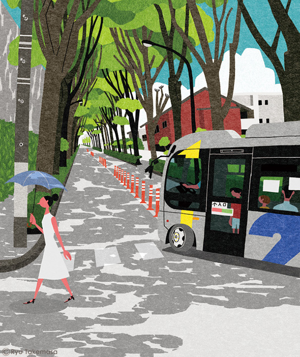
Ryo Takemasa
http://ryotakemasa.com/works/ahead/


Ryo Takemasa's work has a lot of narrative in all his editorial illustrations. Each one is composed in a way that makes certain objects or characters become a lot more interesting and make you think further beyond the drawing, displaying that composition is important within editorial. His illustrations have a paper cut out effect look to them however there isn't any info on the process on his work but it is very nicely crafted.
Paul Blow


Paul Blow has done a lot of editorial especially for the Guardian and it also emphasises the important of the composition. Aspect such has the big hand or the small people really help build a narrative for the article. One element of Paul's work i really like is his use of colour it is consistently bright and help bring out key elements of the image.
I imagine there is a lot of thought process behind Paul's work as it well thought out both in the image and making process of it. i imagine most of his work is done digitally but his use of half tones and textures can give it a screen print aesthetic.
Study Task 3
Blexbolex
I received his book "people" as a birthday gift one year and i have always been interested in the printing style of this book.


The shapes, colours and textures are all enhanced through the process of printing. all the shapes are smooth and bold, like blocks of colour moulded into different shapes to make up a person. some of it has subtle over lapping too to add a darker tone for shades and outlines. this is a technique which i think would be useful in my process. Most of these prints range between 3 to 4 colours which helps me look at effective ways to limit my colours.
May 68 students


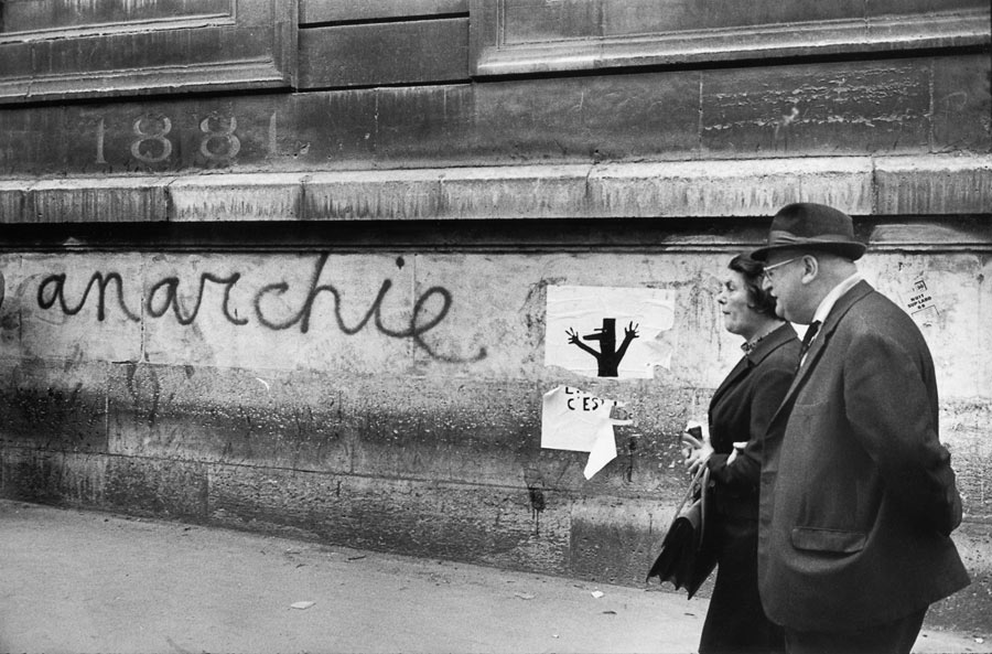
Mai 68 is something i am studying for cop after finding loads of re prints of the posters. I would say my work has taken a big influence to this after being introduced to it. The immediacy and simpleness behind them are a good example of printing being able to spread a message fast on a large scale. It's made me focus a lot more on printing bold shapes and thinking about an effective lay out for my images which are definitely present within these prints.
Nathaniel Russel


Nathaniel Russel uses wood cut techniques in his work. Although this a form of printing i don't think i will have the chance to try within this brief seeing these positive propaganda posters really inspire me to try it. Bold shapes in woodcut are hard to do this therefore adds interesting textures to the prints. The playfulness of all of these prints make wood cut seem like a good development step as i am use to see wood cuts in a very detailed form but in a child like way they can look very fun.
Subscribe to:
Comments (Atom)