Wednesday, 15 March 2017

Giorgio Moroder


I have been familiar with this disco man for a while now, but i never took the time to really look into him. I'm glad i did though, because this guy is as disco as it get's i searched for him on youtube to see if he had any music videos i discovered this gem. This is probably one of the funnest videos on the youtube. It has everything a disco video needs.

  • intense fast synth stuff 
  • sparkly woman that look like stars dancing 
  • lots of weird shapes and colours 
  • occasional shots of Giorgio wearing this crazy silk bomber jacket with what appears to be a beach scene on the back
  • lots and lots and lots of flashing lights.

i have linked it below to show you what i mean.

https://www.youtube.com/watch?v=PfAu8vqAHxc

Giorgio is the pioneer for Italian disco which is seen as more unique form of disco. Which later with giorgios help paved the way for EDM.

He helped shape a 70s italy and really captured the style of what was going on at the time into his songs.

 to create his music he used a lot of complicated synths and moog synths and was obsessed about trying to make the sound of the future and a lot of his work does sound ahead of it's time especially for the 70s.

Line and Texture

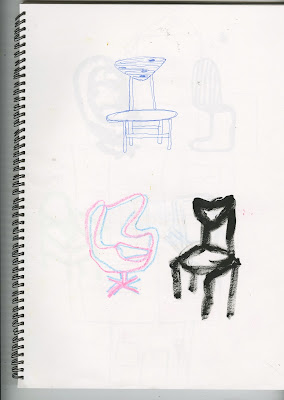
These are drawings mainly from reference. There is a mixture of wrestlers, chairs and kung fu. Each one is focusing on a different element the wrestlers is mainly just drawing from refernce with different media. The chairs are for texture and the kung fu is all about that sweet line.


i think the texture on this chair isn't there for depth or shading but just adds more personality. maybe makes it look a little unclean. i think this chair has some kind of narrative to it and i think it's the texture that helps that and maybe the line to as i feel like this chair gives of vibes that it's fed up of people sitting on it all day. It really can't catch a break.

I like the tones on this one i think the white and black are nicely balanced out. 

Here are some playful lines i learnt during the session that you can get more interesting lines when you relax your hand differently and i think on the Shaolin monk this works nicely he looks like he's in motion 


Add caption


I want to talk abou the black chair specifically on this as i did it with my fingers and personally i enjoy it i think drawing with your finger gives you an instant interesting line and texture all in one.  


Here is some use of pattern i think it adds character to the chair but it think after learning a bit more about how to add tone and depth to an image i could execute this image a lot better by incorporating pattern and tone all in one.

Overall, these sessions have made me think about line and texture way more than i ever use to in my work i am also much more confident to just go straight into a drawing or sketch and accept that the outcome might bring interesting mistakes which will be useful for any final images or work.

Drawing around Leeds


 Early, early, early, early on in the course me and the class adventured around Leeds to practice in observational drawing. I practiced drawing people, furniture, nature and buildings. I always struggle with observational drawings. I usually find it hard to frame the image or maybe miss crucial details which sometimes don't effect the image but can effect the balance of the the thing that i might be drawing.


These where a couple of playful pen texture and line stuff. I do quite like the one on the bench think the black deep tones look nice next to the other bits.

I usually always go free hand with things but i used a ruler to perfect the lines on this and even though i'm no architect i think this looks rather nice i think some added tone to this would make this image a lot stronger over all. 


 I tried to use a mixture of media while doing this activity to explore different possibilities of drawing from life. Some paid of better then others. I felt overall on this i found it easier to pull out certain elements of a scene and draw them separately. I think when i do this again i will attempt to focus on more full bleed images and accept the fact that mistakes will happen.


Composition, Texture and line

For the composition piece i got a rat, under a bridge with a radio. This felt like a very realistic set of objects. I sketched them out originally trying to include as many different variations as possible.
I felt like the large rat was one of the most interesting compositions and gave it instant focus.
I also liked the idea of the bridge acting as a frame for the image. This was something i learnt from the composition session that i thought was effective.
This was my favorite image as the rat contained nice texture and the bridge showed slight depth which made the images composition a bit more interesting. However, the radio was very much hidden in this which is why I did another one with a little more focus on the radio.

This is the 2nd version which does have more emphasis on the radio however, i think that the image as a whole isn't as pleasing something about the composition annoys me i think it's the fact that the rat looks too framed. The textures in the first image are also a lot nicer.

Collage

For visual language I attempted to collage around my chosen subject which was originally kung fu but i started to get super bored of that. So then it changed to chairs. However, in this experiment I cooperated both in some of the images.
Before the session i wasn't really a big collage fan. I guess i had lot's of past unsuccessful attempts with some collaging. Although i really enjoyed doing it i felt like i learnt a lot more on how to make images that already exist and give them a new narrative.

i was most pleased with these chair stealing bats.


I think the composition of this one worked well all the separate photos slotted together nicely. It looks like he is kicking the chair into space.


  Overall, I thoroughly enjoyed doing this i haven't really explored collaging since but i think it helped me a lot with composition of images and drawings. I do however, love the narrative that collaging can bring to an image and think i would like to explore this a lot more.

Saturday, 11 March 2017

FInal GIfs

This is my final gif for the hand drawn one it took about 30 frames. There was a lot to work out with this gif as i needed to make the car hitting it smooth i originally did way too many frames for it which made it look slow and out of place however i realised cutting out them frames made the car bash into the bird way faster making it look a lot more realistic.
I think the action of this gif fits well with the song i kept imaging a car as a character but i think it works better as a object to a character. I also wanted to portray the characters doziness within the gif. I think this worked in a way with it's low reaction speed to the car. it was all done with ink and i think this is the one i am most proud of out of all of them. 

The 3d one i found a challenge i made a model out of polystyrene and covered it in paper strips but once i made the model i had no idea what i wanted to do with it. I thought a easy way to animate it would be to move a background behind it while making it shake like it's walking. Elements of this work however i think it could be done a lot smoother as it is a bit jittery. This gif would look a lot better if it flowed from the start to the end so it looks like it's moving constantly through the clouds however there is an element of stop and start here. 


I have never worked digital before and i did find it particularly hard but i think this gif didn't turn out too bad the fireworks where relatively easy to animate and the bird took longer but i think it works out. I would of probably put in a few more frames of the bird to make it more obvious maybe of it opening it's mouth, but overall, i enjoyed using a digital format for this and i think it's something i would try again even if it was a little uncomfortable.

Further character development and final character design.

From my peer review group I learnt that this was a popular character and people thought it would especially work with the trunk moving. I sdeveloped it a little however i still wasn't a big fan it also reminds me a lot of Bar bar the king of elephants.

Here's some development with toning and texture think this looks rather nice to be honest. I also worked on his really really long trunk as an idea.

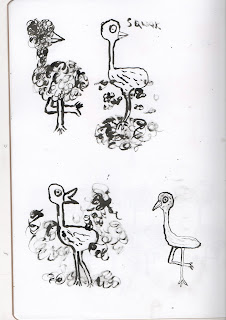
I was walking through Leeds the other day and on my way i saw i very dozy pigeon crossing a street and nearly getting hit by a car. This gave me an idea. A dozy, gormless bird with lots of feathers. potentially getting hit by a bird or scaring itself.  


I thought that a good gif for this character would be if it had a nasty shock and then revealed this skinny gross naked bird underneath. This might be a challenge to animate however. 

I think this is a good colour choice for my bird it gives it an almost flamingo look to it.
i would like to do the hand drawn one in ink to purposely get an inconstancy with the feathers so it gives it more movement in each frame.