Tuesday, 28 March 2017
Stamps
I didn't really like my post stamps. I tried to keep them flowing with the same theme of the poster and postcards but I think they came off less effectively.
I tried to use the same colour palette as the rest of my work for a more effective set.
I think the circuit board one worked well i was inspired by a florucci patch i saw online which was from the same era as Giorgio and saw it as a good connection to his work and the fashion of the time.
Giorgio Moroder research responses
At the beginning of my research I mainly focused on his image and the basic elements of Giorgio.
This made made me feel stuck and a bit clueless into where i was going to take this project as i didn't want it to be an obvious portrait project. After talking to Jamie I realised that i should be looking into more about what Giorgio has done and influenced instead of his apperence.
This is when i started to focus more on Giorgio's influence on electronic disco music and 70's disco culture.
i never usually use paint or create a full bleed image but i think this worked out well and will be something i will want to experiment with more in the future.
 |
| This was one of my influences to do my work in a digital format as i think this made me realise how effective shapes can be digitally. |
Postcards
I was initially inspired to do these by a paper cut out image i made in the research.
From researching Giorgio Moroder i realised how many different elements of a synth he uses to create his disco songs. So i decided to create this separately as an initial experiment at first moving on from the paper cut outs to digital. however, from creating the first one i decided that it was an effective way to create these images. Maybe i should of experimented more with paper cut outs or other formats?
However, i felt like i wanted to create this work in a new format which is why i stuck with digital.
I wanted to make them all separate colours as they are separate elements of the same instrument which Giorgio is known highly for making mainstream which is the synthesizer.
None of the images are entirely accurate i mainly just looked at old synth and the shapes and then translated this on illustrator.
Poster for Giorgio Moroder.
I wanted to approach this project with a format that I'm not too used to just because I wanted a change from my child like crayon and ink drawings.
From my research I decided that digital would be a suitable format for Giorgio Moroder and also a change from my previous work.
The poster features all 4 of my postcards slotted together.
When I originally put them together the colours of them all clashed therefore I decided to make the poster one colour. I chose orange to relate to the 70s era in which Giorgio made his music.
I didn't however change the colour of the wires as i thought this slight mix of a different colour added emphasised the confusing wires that you might get on a Moog synth.
I then completed it with a similar looking piano synth that Giorgio would of used to combine the elements of how he creates his songs and the digital instruments he uses.
If i could maybe develop this poster more i would of quite like to of seen what it would of looked like as a screen print and the shapes might of translated well through this format.
sticker design and development
This is my ideas and development for the stickers. I started thinking of a nice selection of random acts of kindness.


I thought about what sort of things would translate well into digital vectors and shapes so i played on this dog idea for a bit
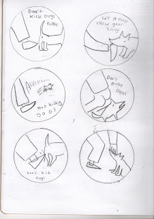
i really liked my builder slogan so i decided to work on that i wanted to do it 100% digital so I drew out some concepts on paper first to make it a bit easier.
 |
| Add caption |
 |
| I found it hard to draw it out well cause i knew it would eventually be done on a computer |
 |
| The bottom one was the final one i decided on after that i would play around with it on illustrator to decide on the colours and the final composition. |
FInal Sticker
I found it very difficult at first to work with vectors i have used illustrator before but usually avoided it as it has always been a long painful process for me. However i think this went quite successfully. I like working with shapes so this was a nice way to experiment with shape building. However, once i finished it felt like it didn't seem very original to me i think vectors are hard to but your own spin on it. I would love to develop this however, and work with digital shapes more and see if i can develop this.
Monday, 20 March 2017
Line of Sight & Depth - Windows
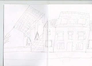
I have always found depth difficult it took me many different window views to finally get to one i seemed comfortable with as i do find it hard to draw 3d things and depth.
I really like my practice sketches for this i think even though they don't show much depth they have all the elements i need for my final thing which is what i set out to try and do.
When it came to my final one i picked my first sketch as it had the most amount of interesting layers that individually would be easy to create. I always wanted them to stand up as i think stuck down on paper then the depth wouldn't be effective. I also added a confused giraffe to add some fun and see if it add more perspective to my image. I think the first layer bars as a photo add a 3D element to the image which worked well.
In terms of image making the textures and patterns of the floor and trees are nice with the different tones of blues.
Subscribe to:
Comments (Atom)


